
Ortho Mattress, location Pages // UX UI Visual Design
GOAL
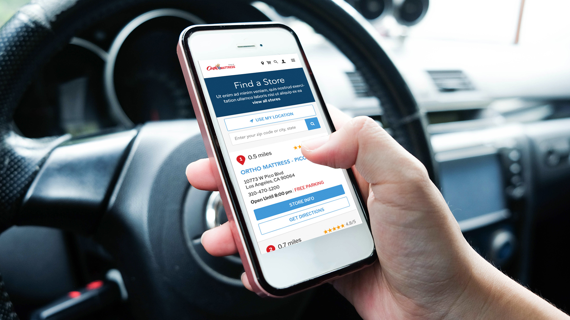
As a click to brick business, Ortho Mattress relies heavily on the usability of its location pages. The location pages consist of the main landing page, and each individual location’s page. The goal of this project was to enhance the location page experience, making it a more fluid process for users to find the location closest to them, get directions, and find out more about that specific location and current sales. See it Live
Impressions / discoveries
Through the process of evaluating the previous design and its usability, I discovered this was a UX, UI, and visual design challenge. Common UI elements and styles were not defined or consistent, creating difficulty for users to easily find what they are looking for and know where and what is clickable. I started the project by reviewing the site as a whole, pulling elements that fit the brand, and creating a new style guide for design and dev to share.
The experience from the main landing page to the individual page was disjointed, designed with inconsistent UI elements, font styling, and even varying grids. In order to create a more fluid experience, I decided to design elements that would be shared between the two pages. When evaluating the requirements, I pulled out the elements that were important to the overall experience, such as seasonal sale banners, value propositions, and customer service touch-points.
Previous Designs Below.
Previous Locations Landing Page
Previous Individual Location page